Muskegon Surgical Associates

Who is Muskegon Surgical Associates?
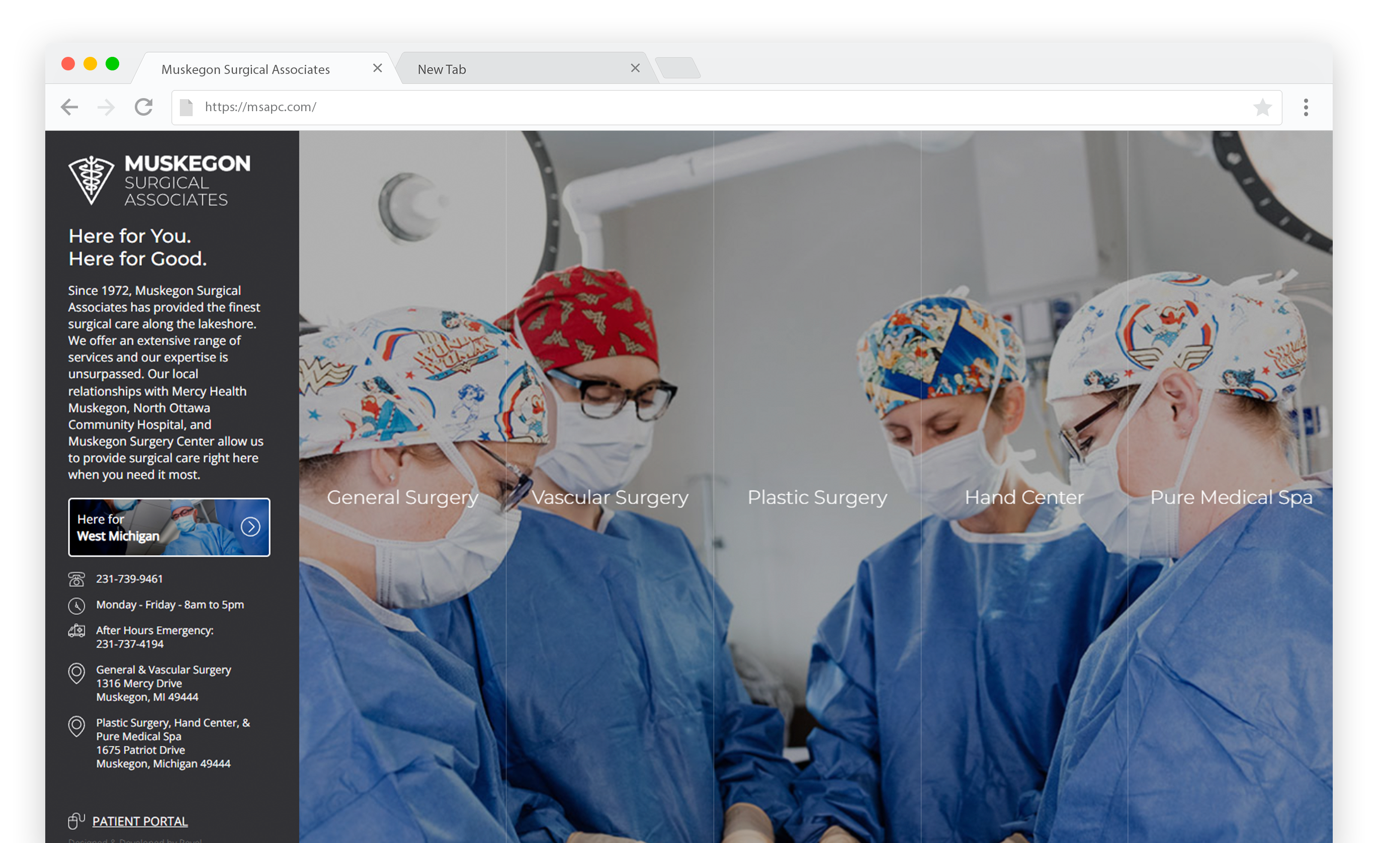
Muskegon Surgical Associates (MSA) is an independent practice that offers a wide range of health care services that includes general surgery, vascular surgery, plastic surgery, hand surgery and therapy, and medical spa treatments.
The Goal
MSA’s primary goal is to communicate to their local audience that they can get expert medical services right in their own community.
The Challenge
MSA provides five “service buckets,” but they appear like they are their own business entities. Each service has their own brand style and website.
The Result
All services now use the same website design with a consistent navigation structure. Each service is personalized with photography taken on location and complementary color palettes, along with messaging that communicates how the service can benefit new and existing patients.
A Family of Services
MSA has five “services,” but each are treated like a separate “business.” Each service has their own staff and physicians, offerings, and clientele… so they have their own identity as far as color, imagery, and brand messaging.

An Informative Expert
On MSA’s old website, they didn’t have any information about the conditions they treated. To improve SEO, expertise, and the user’s experience with MSA, it was recommended that they develop informative content about conditions. This information includes an overview, symptoms, causes, how it’s diagnosed, treatment options, risks, and before and after surgery information.
To this day, MSA continues to add and expand upon their websites. They’ve even started developing videos about each condition, which personalizes it, but it also gives the user an alternative way to consume the information.
Similar Navigation & User Experience (UX)
Previous to this update, the Plastic Surgery, Pure Medical Spa, and Hand Therapy services had a completely different website design from Vascular Surgery and General Surgery. Not only was the other website design difficult to use, it created a disconnect in experience among all the services (they didn’t feel like they were a part of the MSA family).
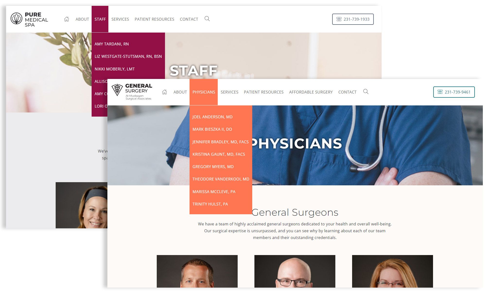
All services now use the same base design – Plastic, Pure, and Hand adopted the same layout as Vascular and General. While he navigation isn’t exactly the same across all sites, it is consistent in taxonomy and order of information.

Same Website Structure
Now that all services use the same base design, the homepage plus each unique page template is laid out in the same manner, which makes all of the websites more cohesive.
