Vans Pines Nursery

Who is Vans Pines Nursery?
Vans Pines Nursery is a tree nursery that grows genetically superior seedlings who sells them to other nurseries throughout North America. They pride themselves on cultivating seedlings with healthy root development which leads to quicker growth, disease and pest resistance, and longer-lasting trees. Their seedlings are considered a premium product in the tree industry.
The Goal
They wanted a website that visually represents their premium product, provide a better shopping experience, better communicate their programs, as well as reach younger generations of growers by providing a responsive website with a good mobile experience.
The Challenge
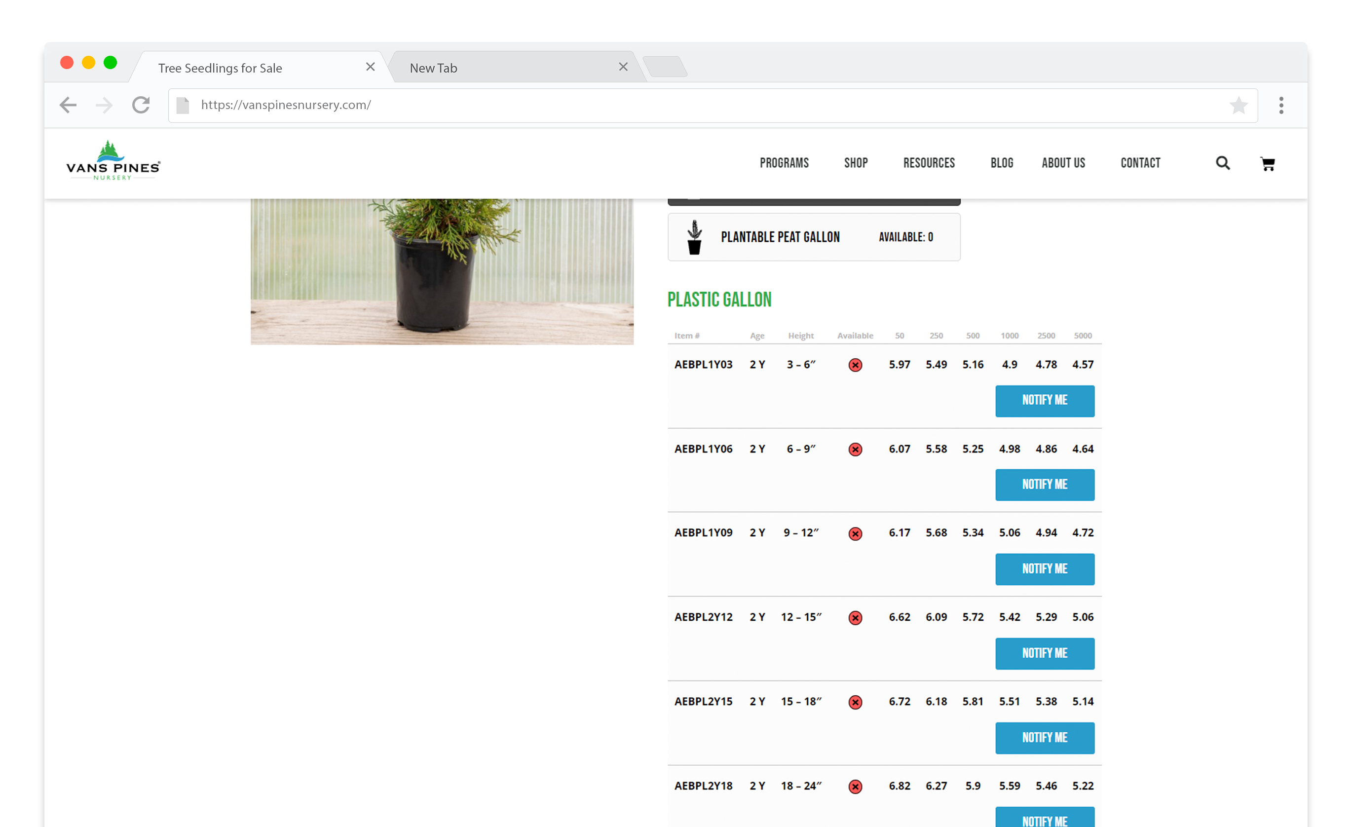
Their customers like to view tables of their products and make comparisons at a glance. These tables display a lot of information such as SKU, age, height, quantity, and pricing… and large tables are a challenge to display on mobile devices.
The Result
Vans Pines’ new website is easy to navigate and use on both desktop and mobile. The website uses a custom designed and programmed table feature to responsively accommodate the product pricing and availability on the product description page. Images are used throughout the site to clearly communicate their programs and products.
Accordion-Style Tables on Mobile
Tables are often neglected on mobile and are usually defaulted to simply allow scrolling from side to side; or by freezing the first column and then allow scrolling from side to side; or allowing the table to become “responsive” by rearranging the headers along the left and displaying the row data to the right, creating large chunks of information for each row. None of these solutions was going to work for this client because they don’t let the user easily compare data at a glance.
I approached the design of this table mobile first and considered what information someone needed to know right away. Below is the end result. On mobile, each row displays pertinent information about the product such as the SKU, age, height, and whether or not it’s available. Then if the user chooses, the row can be expanded to reveal pricing per quantity breakpoint. The table is compact, allowing the user to easily compare several rows of data at one time.

Clear Program Information
“Programs” is another word for how the product is available for purchase. On the previous website and in existing literature, the programs aren’t illustrated or they’re explained through verbose descriptions. The new programs overview page simply breaks down each program using images to visually show size comparison with hotspots that label the age and size. Each program also has its own page further explaining the features and benefits (and cons) of each one.
A Better Shopping Experience
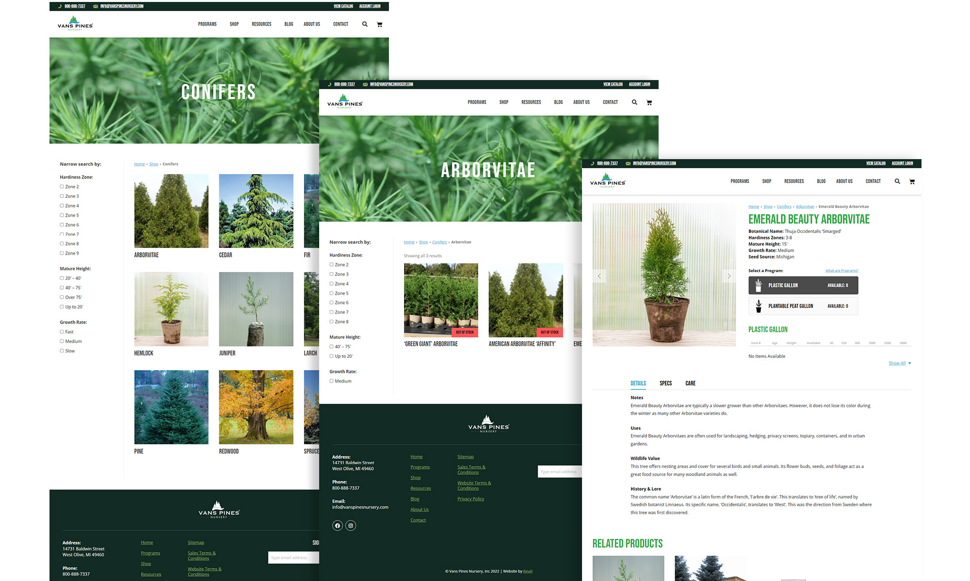
The updated shopping experience uses a traditional and familiar e-commerce style experience. Users are able to broadly narrow their search by species (product categories) and then further narrow the selection by hardiness zone, mature height, and growth rate. Each product page includes additional details, program information and availability, and care information.

A Premium Product
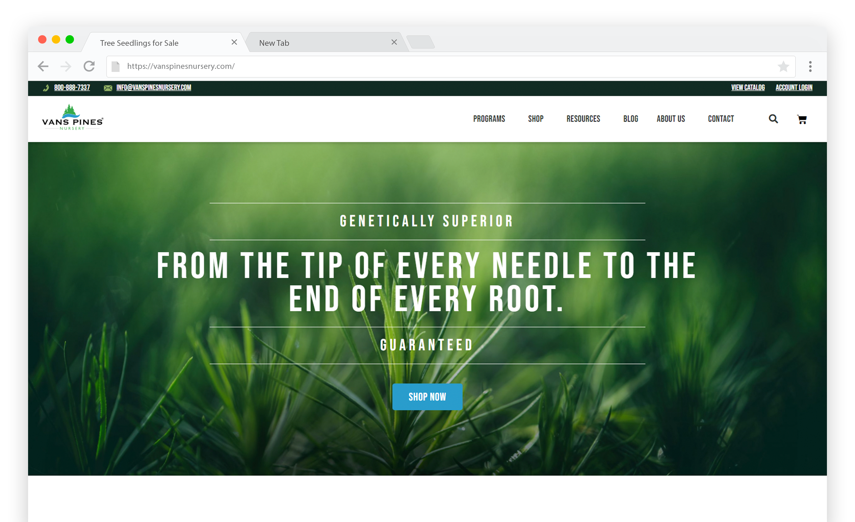
The website incorporates Vans Pines’ latest campaign theme, tying their brand nicely across multiple marketing mediums. Their website is clean and easy to navigate, their content is easy to understand, and the beautiful photography and small illustrative details give it the extra look of professionalism.
